
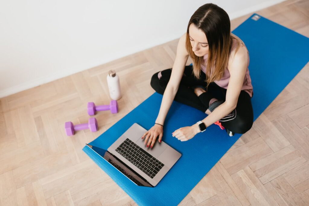
A fitness website should do more than look energetic. It should help a potential member move from curiosity to a useful next step, whether that means viewing a schedule, comparing memberships, calling the front desk, or booking a first class. Strong fitness website design combines a clear message with practical information that visitors can find without effort. That matters because people arrive with different levels of readiness. A first-time visitor may want reassurance that beginners are welcome. A returning member may only need tonight’s class times. Someone ready to join may be looking for pricing, trial terms, and a quick booking process. Your site needs to serve each person without making them dig for answers.
Table of Contents
Key Takeaways
- Visitors should understand what you offer and what to do next within seconds.
- Simple navigation, current schedules, and visible pricing reduce hesitation.
- Mobile usability, fast pages, and accessible controls are core requirements.
- Real photos, trainer details, reviews, and clear policies build confidence.
- Each page should guide visitors toward one primary action.
Why Fitness Websites Need a Clear Visitor Path
A visually impressive page can still underperform when visitors cannot tell where to go next. Every important page should have one primary goal. On a class page, that may be “View the Schedule.” On a membership page, it may be “See Membership Options.” On a trainer profile, it may be “Book a Consultation.” Start by mapping the questions that prevent action. Visitors commonly want to know what training is available, who it suits, where you are located, when sessions run, what they cost, what to expect on day one, and how to get help. When a page answers those questions in a logical order, it feels useful rather than sales-heavy.
Build a Homepage That Works Like a Short Tour
Your homepage should introduce the business, show the available paths, and make practical details easy to reach. It does not need to explain every program in full. Its job is to help people choose where to continue.
- Hero section: State who you help, what kind of training you provide, and the most relevant next action.
- Program overview: Give brief descriptions of classes, coaching, small-group training, or online options.
- Proof section: Include member feedback, trainer credentials, facility images, or community highlights.
- Practical details: Link clearly to pricing, schedules, location, and contact information.
- Final action: Repeat the main call to action near the bottom for visitors who are ready after scrolling.
Make Navigation Simple on Every Screen
Use plain labels such as Classes, Schedule, Pricing, Trainers, About, and Contact. Clever labels may fit a brand voice, but they should not force visitors to guess where essential information lives. Keep a prominent action in the header, such as “Book a Class” or “Start Your Trial,” and make the logo return users to the homepage. On phones, the navigation should be short, easy to tap, and supported by useful footer links. Include a tap-to-call phone number where appropriate, and do not hide pricing or schedules several menu layers deep. A person standing outside your facility should be able to find the next class in moments.
Design for Mobile Visitors First
Mobile design is about more than shrinking a desktop layout. Use readable text, comfortable button spacing, short forms, and schedules that remain understandable in both portrait and landscape views. Test the complete booking journey on real phones, including confirmation screens, payment steps, and error messages. Performance deserves the same attention. Large photos, background videos, embedded calendars, and third-party booking tools can slow a page down, so run loading speed checks before launch and after major updates. Compress images, limit unnecessary scripts, and avoid autoplay media with sound.
Use Clear Calls to Action
Vague buttons such as “Get Started” can work when the context is obvious, but more specific language lowers uncertainty. Tell visitors what happens after they click.
- Book a Class: Best when availability and registration are ready.
- View the Schedule: Useful for visitors comparing times first.
- See Membership Options: Helpful when cost is the main question.
- Meet the Trainers: Supports trust when coaching style matters.
- Ask a Question: Gives uncertain visitors a lower-pressure path.
Show Pricing and Schedules Without Friction
Pricing should be easy to locate and easy to understand. Show what each membership includes, whether a trial is available, and whether enrollment fees, contract terms, or cancellation rules apply. If pricing varies by program, provide a useful range or explain what affects the final amount. Schedules need the same care. Keep times up to date, note the date of the latest update, and let visitors filter by day, class type, instructor, or skill level when the schedule is busy. Do not make people create an account to see when a class begins.
Build Trust With Useful Proof
Trust signals should answer reasonable concerns, not overwhelm the page. Use real member reviews with permission, genuine photos of your facility and classes, trainer bios with qualifications, and clear information for beginners. If you have policies related to injuries, accessibility needs, late arrivals, or cancellations, make them easy to find. Be careful with transformation claims. Share authentic experiences, but avoid promising guaranteed outcomes. People are more likely to trust a gym or coach that explains the process honestly than one that makes dramatic claims without context.
Make the Site Welcoming to More People
Accessibility should be part of the initial design, not a final checklist item. Use strong color contrast, descriptive image text, captions for workout videos, keyboard-friendly navigation, and form labels that clearly explain what is required. Never rely on color alone to show class availability or difficulty level. Your content should also be written for people first. Following people-first content principles encourages pages that answer real visitor questions instead of repeating generic fitness phrases for search traffic.
Create Helpful Content and Test the Journey
A resource section can support visitors before they are ready to commit. Publish beginner guides, clear explanations of class formats, first-session preparation tips, trainer-led advice, local updates, and announcements about new programs. Keep every article connected to a real question your audience asks. Then test the site with someone unfamiliar with the business. Ask them to find a class, locate pricing, submit a question, and complete a booking on both a phone and a desktop computer. Watch for unclear labels, broken links, repeated steps, and abandoned forms. Fix the largest obstacle before adding new animation or visual effects.
Common Questions About Fitness Website Design
What should a fitness website show first?
The first screen should explain who the service is for, what it offers, and the clearest next action.
Should a fitness website show prices?
Yes, when possible. Clear pricing reduces uncertainty, while variable pricing should include a range or a straightforward explanation.
How often should a fitness website be updated?
Update schedules, pricing, staff details, program descriptions, and contact information whenever they change. Review the entire site at least quarterly.
Final Checklist for a 2026 Fitness Website
- Clear headline and primary action
- Simple mobile navigation and usable footer links
- Fast pages, compressed images, and tested booking tools
- Current schedules, prices, policies, and contact details
- Accessible text, media, forms, and controls
- Real proof that helps visitors feel informed and welcome
A strong fitness website does not need every design trend. It needs to make visitors feel confident about what happens next. Clear structure, up-to-date information, reliable evidence, and a smooth mobile experience turn a website into a practical tool for growing your fitness business.
Conclusion
A successful fitness website is designed around the needs of its visitors rather than visual trends alone. When important information is easy to find, schedules and pricing are kept up to date, and every page leads naturally to a clear next step, people can make decisions with greater confidence. Fast performance, mobile-friendly layouts, accessible features, and authentic content all contribute to a more welcoming experience for both new and returning members. By regularly reviewing navigation, updating information, and testing the complete user journey, fitness businesses can create a website that not only reflects their brand but also supports real-world goals, from increasing memberships to strengthening long-term engagement with their community.