

Table of Contents
- Introduction
- Implementing a Single, Focused Call-to-Action
- Ensuring Mobile Responsiveness
- Utilizing Clear Visual Hierarchy and Whitespace
- Incorporating Trust Signals
- Optimizing Page Load Speed
- Conclusion
Key Takeaways
- Implement a single, focused call to action (CTA) to guide user behavior.
- Ensure mobile responsiveness to cater to the growing number of mobile users.
- Utilize clear visual hierarchy and whitespace to enhance readability and user experience.
- Incorporate trust signals such as testimonials and security badges to build credibility.
- Optimize page load speed to reduce bounce rates and improve user engagement.
Introduction
In digital marketing, your landing page is often the first impression potential customers have of your business. A strong landing page can convert casual visitors into leads and is a critical component of any successful online campaign. By studying proven landing page examples, you can gain insights into what drives action and maximizes your conversion rate.
Each landing page should have a clear objective that aligns with your core business goals. Thoughtful, deliberate design leads visitors naturally toward your desired action, whether that means signing up for a newsletter, making a purchase, or downloading an e-book. In a competitive landscape, attention to landing page best practices can be a clear differentiator, helping you stand out and make a memorable impact from the very first click.
Design and user experience are closely connected. If your landing page frustrates users or feels cluttered, bounce rates will rise, and conversions will fall. By streamlining every aspect of your page, you ensure that visitors will stay longer, engage with your message, and are much more likely to take meaningful action.
Conversion-focused landing pages require ongoing testing and refinement to remain effective. Even minor changes to layout, headline, or imagery can result in significant shifts in engagement. Regularly review analytics data and leverage A/B testing to continuously improve for your audience.
Implementing a Single, Focused Call-to-Action
One of the most common mistakes on landing pages is having too many competing calls to action. Cluttered choices cause visitors to hesitate and can ultimately reduce conversions. A high-performing landing page prioritizes a single CTA, using it as the focal point around which all other design elements are organized. By keeping your message clear and direct, you guide users smoothly toward your business goal without distraction.
Positioning, color, and language are essential when highlighting your CTA. Bold, action-oriented words such as “Get Started,” “Try Free,” or “Download Now” help create a sense of urgency. Surround your call-to-action button with adequate space and ensure it visually stands out from the background and surrounding elements. For extra clarity, consider reinforcing your CTA with supporting copy that explains the direct benefit of taking the action.
Ensuring Mobile Responsiveness
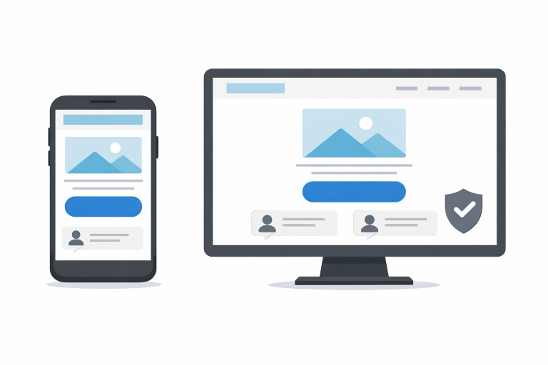
With over half of all global website traffic coming from mobile devices, ensuring your landing page is fully responsive is non-negotiable. A mobile-optimized page uses readable fonts, appropriately sized buttons, and adaptable layouts that scale without breaking. Eliminating pinching, zooming, or side-scrolling creates a seamless experience from desktop to smartphone.
Best-in-class landing pages adopt a mobile-first approach, designing for the smallest screen sizes before expanding to desktop dimensions. This method helps prioritize essential information and supports a more intuitive flow for all users, no matter how they access your site. Mobile responsiveness not only improves the user experience but is also a key ranking factor in Google’s search algorithm, impacting your organic visibility.
Utilizing Clear Visual Hierarchy and Whitespace
The visual hierarchy is the order in which users notice and process information on your landing page. Headlines, subheadings, images, and calls to action should flow in a logical sequence to guide users toward the intended goal. Employing the 60-30-10 color rule (60 percent primary color, 30 percent secondary, 10 percent accent) ensures that important elements, such as buttons and headlines, are visually prominent but not overwhelming.
Whitespace, or negative space, is another key design tool. It provides breathing room around content blocks, making text more readable and helping critical sections stand out. A cluttered page feels overwhelming or confusing. By elevating priorities through hierarchy and whitespace, you keep the focus where it matters most.
Incorporating Trust Signals
Trust is the foundation of any conversation. When users land on your page, they need immediate assurance that your offer is genuine and safe. Visual trust signals such as recognizable client logos, third-party endorsements, awards, review scores, and security badges all contribute to your perceived credibility.
In addition to visual cues, concise and authentic testimonials from real customers or prominent brand associations are among the most persuasive forms of social proof. Feature your best reviews near your call to action, as visitors often scan for reassurance before taking the next step. Research shows that trust elements can substantially lift conversion rates, especially for new brands entering competitive markets.
Optimizing Page Load Speed
Speed matters. Even a one-second delay in load time can reduce conversions by up to 7 percent. Fast-loading landing pages reduce bounce rates, improve user experience, and are favored by search engines.
Improving your page load time involves compressing images, reducing server requests, minimizing third-party scripts, and implementing browser caching. Audit your landing page regularly with tools like Google PageSpeed Insights to uncover additional opportunities for increased speed. Remember, efficient pages not only delight users but also contribute to your overall search rankings and ad quality scores.
Conclusion
Designing an effective landing page is both an art and a science. To stand out and maximize conversions, keep your focus on a single, clear call to action, prioritize mobile-friendly layouts, and leverage strong visual hierarchy and whitespace to guide user attention. Incorporate trust signals to build credibility and optimize loading speed to ensure every visit counts. Regularly analyzing your results and refining your approach based on data-driven insights will keep your landing pages performing at their best, turning more visitors into loyal customers.